I love maps. From John Speed to the OS, and best of all the beautiful Swiss maps, I’ve spent many happy hours pouring over sheets of paper that bring the world to life.
Maps are also the secret to a trick shared by workshop facilitators, qualitative researchers, and dataviz types: if you want to think through ideas, look for patterns, or identify contrasts, make a map.
A map has two dimensions: up/down and left/right, and plotting objects against those dimensions allows us to understand them more clearly because we can take advantage of what our brains do well (seeing) instead of relying on things they do badly (thinking).
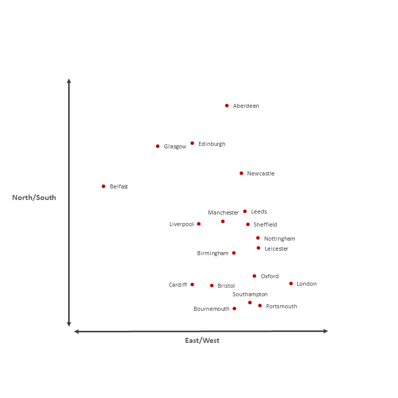
When we think of maps, we tend to think of geographic maps. In this case the dimensions are North/South and East/West, like this:

We can look at that and immediately see that the position of cities in the plot reflects their position in the real world. It allows us to see which cities are close together, and to judge the relative distances between them fairly accurately.
Maps aren’t just for geography
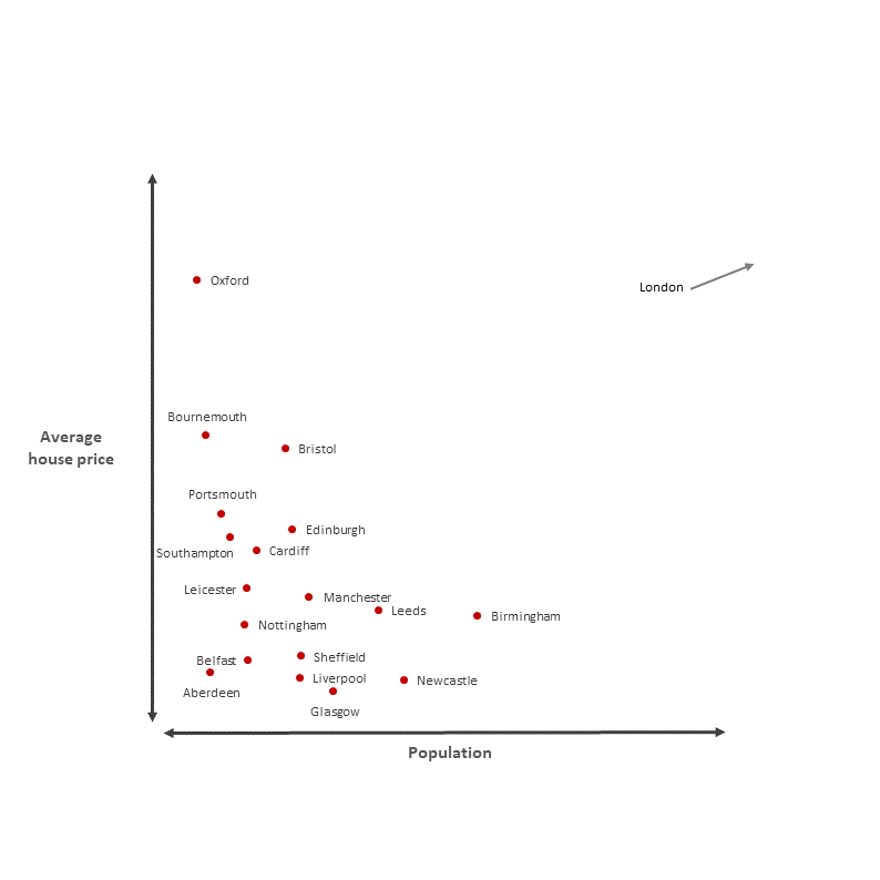
But the reason maps are such a powerful tool for thinking is that the two dimensions can be anything we want them to be. We can map any variables we like onto those dimensions, and when we do so we’ve invented the scatterplot! We could choose, for example, population and average house price:

Once again the position of the cities in the plot lets us see which are close together, which are far apart, and to judge just how far apart they are. That corresponds to real facts in the real world, and visualising those relationships in this way makes them easier to think about. Scatterplot “maps” are, to my mind, a chronically under-used tool for looking at relationships, spotting patterns, and identifying outliers.
But we’re not limited to quantitative maps, those dimensions can as easily be based on judgement as measurement.
A consensus map
Maps are one of my favourite tools to use in workshops, because those dimensions can be literally anything. Working together we can agree where items should lie along each dimension without needing any kind of quantitative measure.
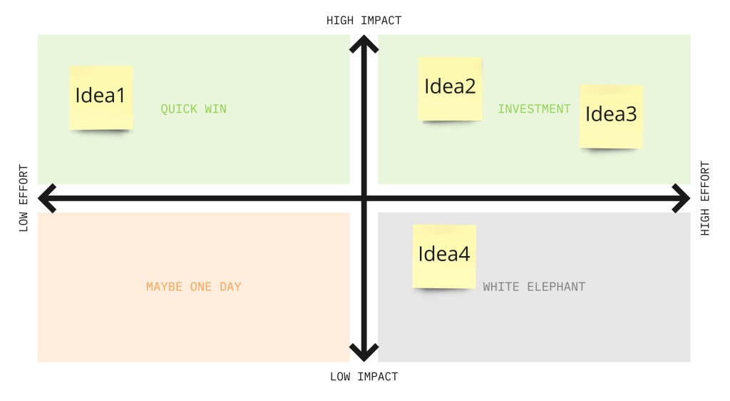
It’s a great way, for instance, to help people prioritise ideas based on how achievable they are versus how impactful they would be:

This is a simple tool that I come back to again and again because it works so well in almost any situation. In fact it’s one of a handful of exercises that I keep in my back pocket knowing that they can inject life into a workshop that’s flagging.
It’s a good illustration of how easily visual thinking can be incorporated into your day-to-day work of thinking or facilitation, without any need to worry about whether or not you can draw. Simple frameworks like this allow us to tap into our visual skills, and create a shared picture of the world.
A map of your thinking
And there’s no need for collaboration, maps are just as useful when it comes to getting your own thinking in order, and especially when it comes to explaining that thinking to other people.
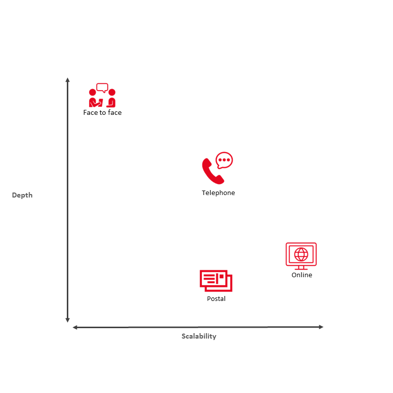
Let’s say I want to summarise different research methods in terms of the tradeoff between the amount of insight you get from each person (“depth”) and the cost/difficulty of getting a large sample (“scalability”). I might come up with something like this:

Clearly there’s nothing quantitative about this. Each of those points could be put in a different place based on different (equally valid) opinions and criteria, but it helps to quickly communicate how I think about the subject.
Maps, as I hope I’ve convinced you, are one of the most powerful tools we’ve invented to help us think about, communicate, and document the relationships between things.
They have a place when we’re trying to articulate our own thoughts, when we’re trying to achieve consensus to make a decision, and when we’re analysing and presenting data; and I think we don’t use them anywhere near as often as we should.
When in doubt, why not try a map?

