 Driver analysis is great, isn’t it? It reduces the long list of items on your questionnaire to a few key drivers of satisfaction or NPS. A nice simple conclusion—”these are the things we need to invest in if we want to improve”.
But what if it’s not clear how to improve?
Often the key drivers turn out to be big picture, broad-brush, items. Things like “value” or “being treated as a valued customer” which are more or less proxies for overall satisfaction. Difficult to action.
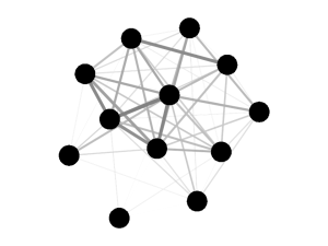
Looking beyond key drivers, there’s a lot of insight to be gained by looking at how all your items relate to each other, as well as to overall satisfaction and NPS. Those correlations, best studied as either a correlogram (one option below) or network diagram (top right) can tell you a lot, without requiring much in the way of assumptions about the data.

In particular, examining the links between specific items can support a design thinking approach to improving the customer experience based on a more detailed understanding of how your customers see the experiences you create.
Your experiences have a lot of moving parts—don’t you think you ought to know how they mesh together?
